

web
web
Web Design
106.9 THE BEAR (CKQBFM)
Radio is a medium where everything is timed to the second. There isn't a lot of room for error and when mistakes happen, well, they get noticed.
Designing graphics and developing a web site for radio is pretty much the same kind of crazy. You build a brand and design for a promotion that goes on the site and might live there for a week, tops. A lot of effort and creativity goes into something that has a very short life.
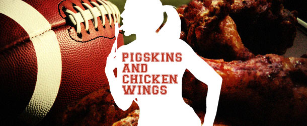
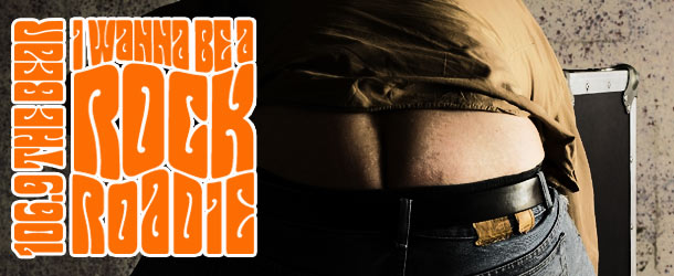
Below is a collection of some of the more memorable promos I worked on. Each comes with its own story. When I say memorable I mean that from the entire spectrum of how a project can go.
boom 99.7 (CJOTFM)
As stated above, radio is its very own thing.
Below is a collection of some of the more memorable promos I worked on. Each comes with its own story.
Web Site Design
In no particular order, here is a selection of web sites that I was involved in.
http://www.actioncry.com
http://www.adrsportred.ca
http://www.annewright.ca
http://www.basketfunds.com
http://www.borealcanada.ca
http://www.blueprintpr.ca
http://www.cair.ca/
http://www.canada2002earthsummit.gc.ca/index_e.cfm
http://www.canadiansport.ca
http://www.canfornav.com/
http://www.canit.ca
http://www.caubo.ca
http://www.cfms.org/
http://www.chicken.ca/
http://www.chsrf.ca/
http://www.cmhc.ca
http://www.condoguy.com/
http://www.desautelsgroup.com/
http://www.environmentandresources.ca/
http://www.etfolios.com/index.html
http://www.ethicalsport.ca
http://www.georgethepersonaltrainer.com/
http://www.gingergroup.net/
http://www.homesvermont.com/
http://www.hrvs.ca
http://www.industrialmedia.ca/
http://www.isdlaw.com
http://www.media-awareness.ca
http://www.mint.ca/acadie_en/index.html
http://www.mint.ca/luckyloonie/default.asp
http://www.mint.ca/poppy/default.asp
http://www.ottawahomesandcondos.com
http://www.pointshotwireless.com
http://www.pongthrob.com
http://www.red-seal.ca/
http://www.sdinfo.gc.ca/
http://www.spca.com
http://www.uofottawa.ca
http://www.warshawgroup.com
http://www.worldheart.com
http://www.youthfluence.com
http://www.xmarksystems.co

print design
A collection of print materials. PDF's are available for viewing as well.
Halogen - eAppraisal (PDF)
Halogen - eEducation (PDF)
Halogen - eFinance (PDF)
Halogen - eHealthcare (PDF)
Halogen - eManufacturing (PDF)
Halogen - eProfessional (PDF)
Halogen- Better Performance (PDF)
Halogen - FactPoint White Paper (PDF)
Halogen - Performance Maintenance (PDF)
Halogen - Ten Key Steps (PDF)
Halogen - Understanding ISO 9001 (PDF)
PointShot Wireless - FactPoint Whitepaper (PDF)
PointShot Wireless - Corporate Overview (PDF)
PointShot Wireless - RailPoint Datasheet (PDF)
PointShot Wireless - RailPoint WISP Datasheet (PDF)
QNX - Aviage Datasheet (PDF)
QNX - Momentics Product Brief (PDF)
QNX - MultiCore Datasheet (PDF)
QNX - MultiMedia Solution Brief (PDF)
Sleep Strategies - Direct Mailer (PDF)
Sleep Strategies - Corporate Brochure (PDF)
Sleep Strategies - Newsletter (PDF)

environmental Graphics
environmental Graphics
Environmental Graphics
I have designed and helped produce signage, trade show graphics, billboards and point of sale systems for many companies. Here are a few examples.
QNX Software Systems
Produced in 2008 for QNX Software Systems. Trade show graphics for their Embedded World installation in Germany
JUMP! 106.9 (CKQBFM)
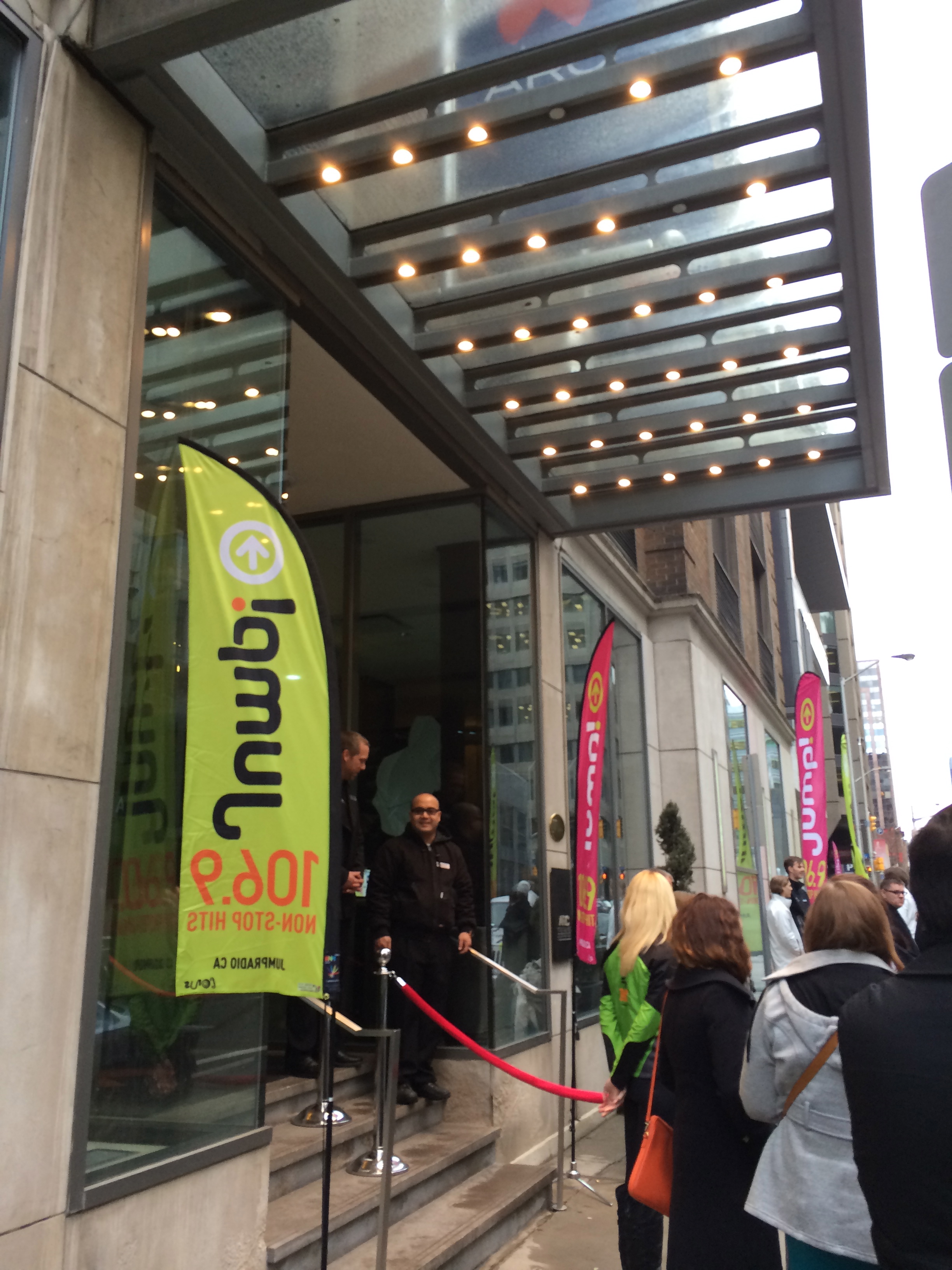
With the change of format from 106.9 THE BEAR to JUMP! 106.9, there was a lot of design work to be complete for the March 31, 2014 launch.
boom 101.9 (CJSSFM) JEEP Wrap
104.5 Fresh FM JEEP Wrap

identity & branding
identity & branding
Brand is Everything.
I'm very lucky to have been a part of the following projects.
MILEHIGH Outerwear
Brand designed for a fashion designer based out of Toronto who has created a line of haute couture bomber jackets.
Miss Spelld
Miss Spelld is a performance concept that has gone through a series of evolutions. It's current incarnation is still under development.
Social Experiment
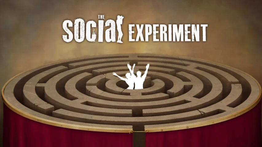
Identity for a local television program that pushes the limits of good taste while giving you some grist to talk about around the water cooler the next day. (Site in development)
TRYBE
BeWellNetworks.com
1999 Dragon Boat Identity
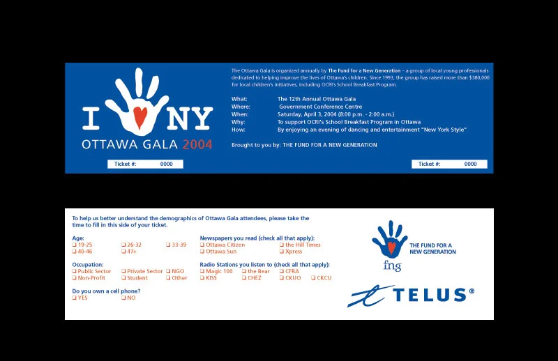
Fund For A New Generation
The Fund for a New Generation is a not-for-profit organization that supports Ottawa's underprivileged children and youth by hosting an annual gala event. Identity design for their 2004 gala.
106.9 THE BEAR (CKQB FM) - Apocalypse-Apalooza
Apocalypse-apalooza was a major station promotion that we started planning a full year before execution. We wanted to use the end of the Mayan calendar (December 21, 2012) as the focus of the promo.
Not trying to brag or anything but I came up with the Apocalypse-apalooza name and, the graphic above, was selected immediately. It feels good to nail the concept from the get go.
The End Is Near! - T-shirts
A collection of irreverent t-shirts that 106.9 THE BEAR gave away to promote the Apocalypse-Apalooza promotional campaign leading up to December 21, 2012.
Apocalypse-apalooza - Trailer Wrap
Trailer wrap that 106.9 THE BEAR used to take to the streets giving away great prizes on location to help promote the Apocalypse-Apalooza campaign leading up to December 21, 2012.
Apocalypse-apalooza - Postcards
These were designed as downloads for listeners. We got each announcer to pose for a different plague or end of he world scenaro. THIS was so much fun to produce.
Break Into The Bunker - Signage System
Signage system developed for use in the Diefenbunker at the December 21, 2012 Break Into The Bunker End Of The World Party. I, Mother Earth headlined.
Break Into The Bunker - Trailer
Trailer Wrap developed for the station trailer. It was taken on the road to promote the End Of The World Party and for giveaways.
106.9 THE BEAR - Ottawa's Bear Babe
I worked on the design and development of the BEAR babe over three years.
THE BEAR EEach month had a new theme and the entrants had a chance to win a $1000 and a professional photo shoot with hair and make up. 2014 is a short calendar as 106.9 THE BEAR ceased to be and became JUMP! 106.9.
2012 Calendar
2013 Calendar
2014 Calendar
106.9 THE BEAR (CKQB FM) - T-shirts
A series of t-shirts designed for staff and to hand out to listeners.

motion
motion
Motion Graphics & Video
I love the moving picture.
Video is something I have been involved in in one way or another since 1994
Break Into The Bunker (2012)
BeWellNetworks.com (2010)
Wild Kratts (2010)
Nortel (1999)
ATI (1999)
McKenzie Beach - Demo Reel
McKenzie Beach - Bell Demo
Animatics Interactive - Demo Reel
Heritage Canada - A day In The Life
106.9 THE BEAR - Heads Or Tails Teaser
JUMP! 106.9 - NYE // NYC (2014)
Ottawa's BEAR Babe (2013)
JUMP! 106.9 - I LOVE THE SENS!
JUMP! 106.9 - BAYSHORE RAP
JUMP! 106.9 - The Big Game

Photography
Photography
Photography
A collection of personal and project related photographs.
Nature
Concerts
Still Life

illustration
illustration
Personal Projects
A series of digital and mixed media pieces created during the Summer of 2013.
Visit the Art section for more recent work.

